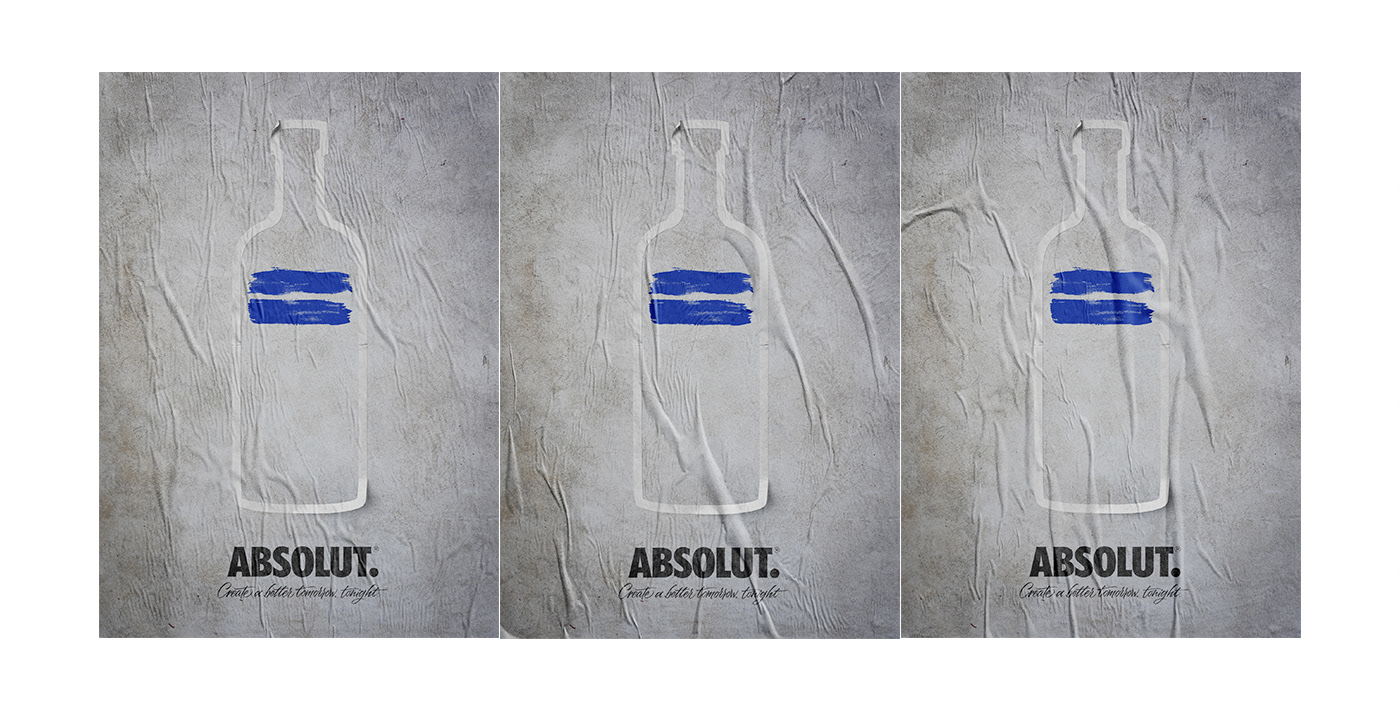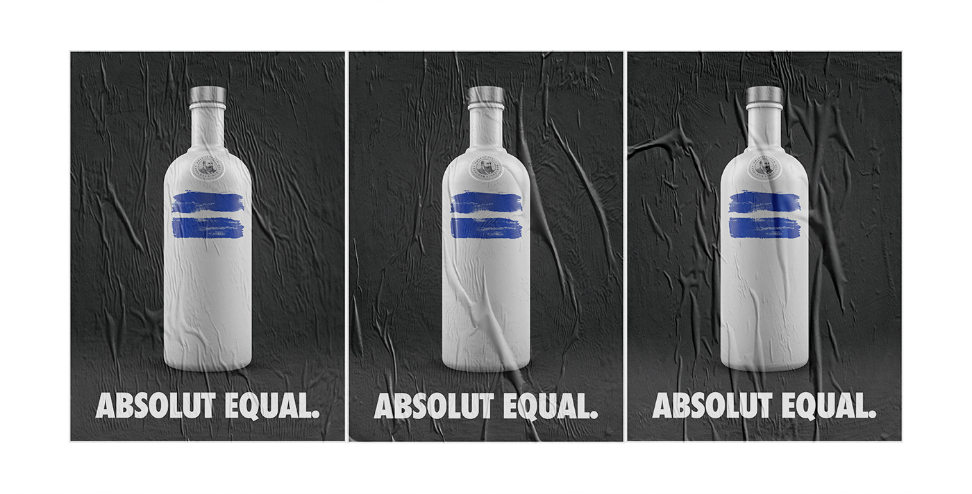
Few brands possess an silhouette as iconic as Absolut Vodka. Over the decades, the Swedish brand has established a legendary history of creative advertising, turning its distinct bottle outline into a canvas for art, culture, and social progress. Spanish graphic designer and creative director Txaber takes this legacy a step further with his conceptual project, Absolut Equal.
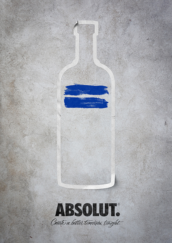
Created as an unofficial creative concept, Absolut Equal strips away all unnecessary noise to deliver a high-impact message about marriage equality and human rights.
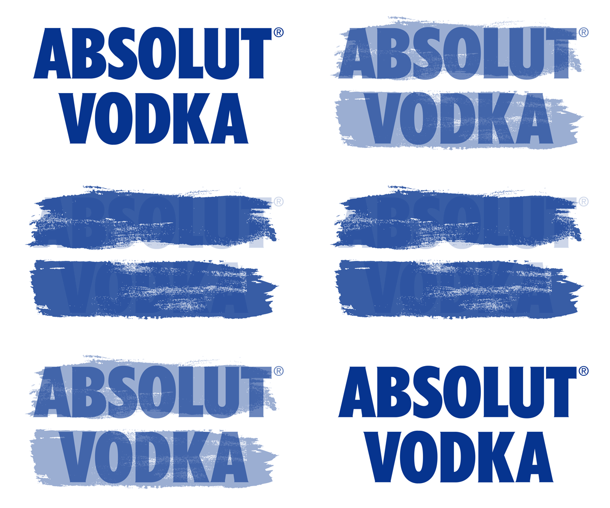
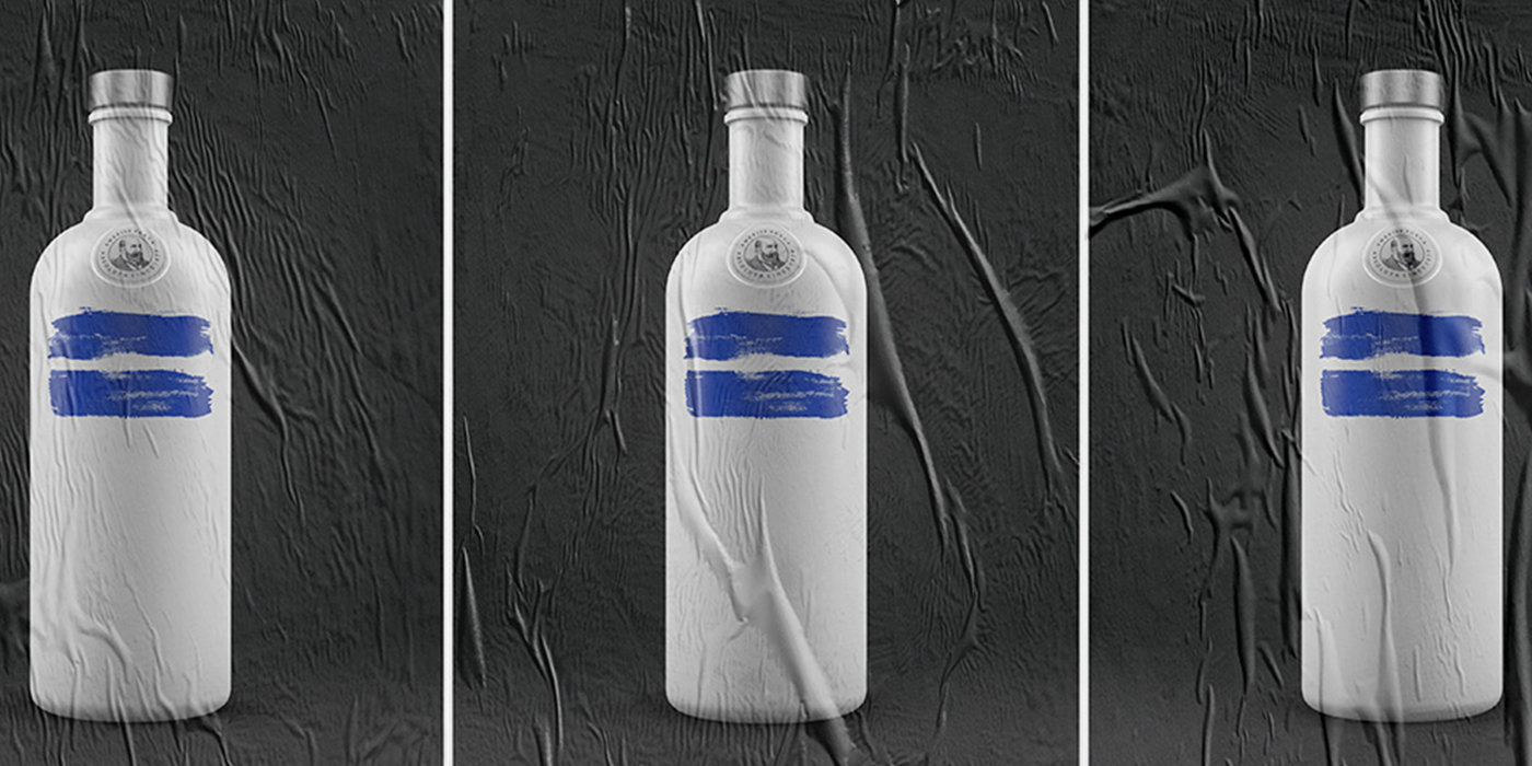
The visual strategy is brilliantly simple: Txaber utilizes the unmistakable contour of the Absolut bottle—rendered in clean, white, sticker-like or matte-finished outlines—and pairs it with two bold, hand-painted blue brushstrokes. Positioned horizontally across the center, these strokes form a striking equals sign (=), instantly evoking the universal symbol for equality.
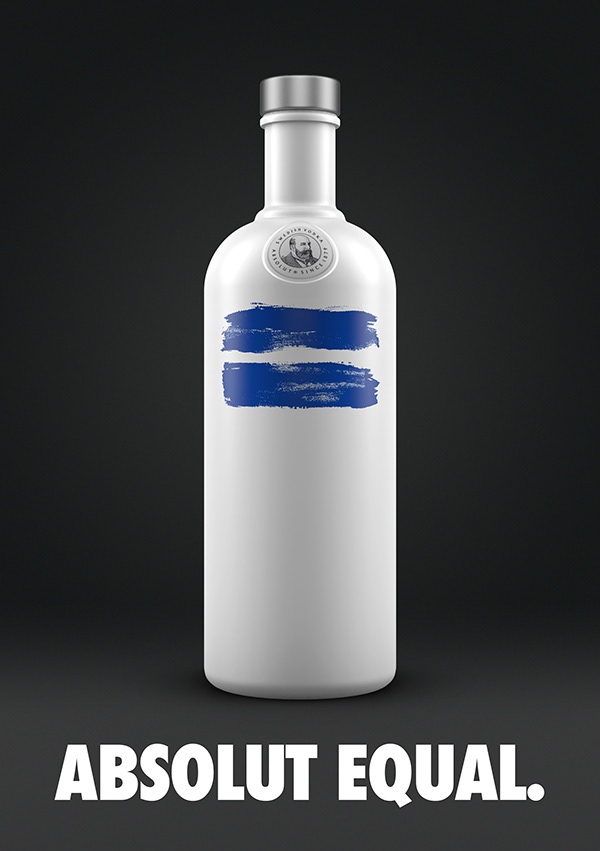
Txaber’s Absolut Equal project is a prime example of how thoughtful graphic design can take an established corporate identity and transform it into a meaningful cultural statement.