


When it comes to creating eye-catching and functional designs, understanding the basics can make all the difference. While there are no rigid formulas for great design, there are guiding principles that help strike the perfect balance between creativity and clarity.
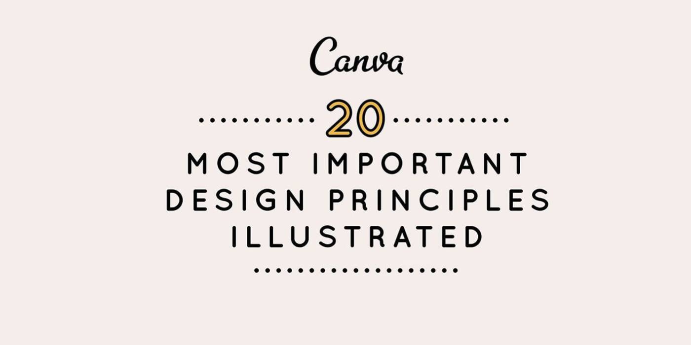
To make these concepts easy to grasp, Canva created a stunning infographic that breaks down the 20 most important design principles—from line, scale, and color to hierarchy, contrast, and movement. Each principle is paired with simple illustrations that explain how these elements influence composition and visual impact.
The guide emphasizes how tools like negative space, balance, and typography can transform cluttered visuals into cohesive, aesthetically pleasing designs. It also reminds us that while rules matter, knowing when (and how) to break them is just as important for creative freedom.
Whether you’re a seasoned designer or just starting out, this infographic is the ultimate cheat sheet for mastering design fundamentals. It’s simple, practical, and a must-see for anyone looking to make their visuals pop!
Check out the full infographic and level up your design game!

via Canva
Comments
