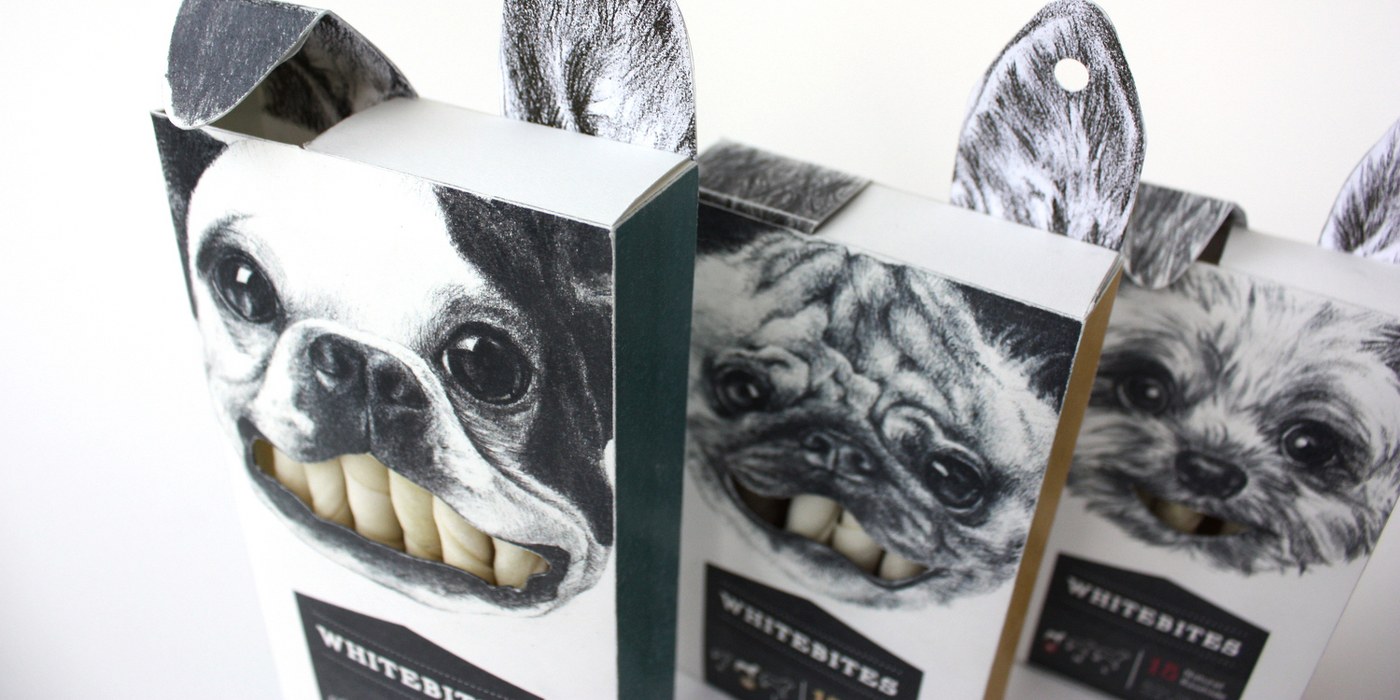
If you happen to have a dog, you may have noticed that there isn’t much of a variety when it comes to dog food and snacks package design. The new solution to his conundrum came about through a combination of humour, a consciousness for the environment, and aesthetics.
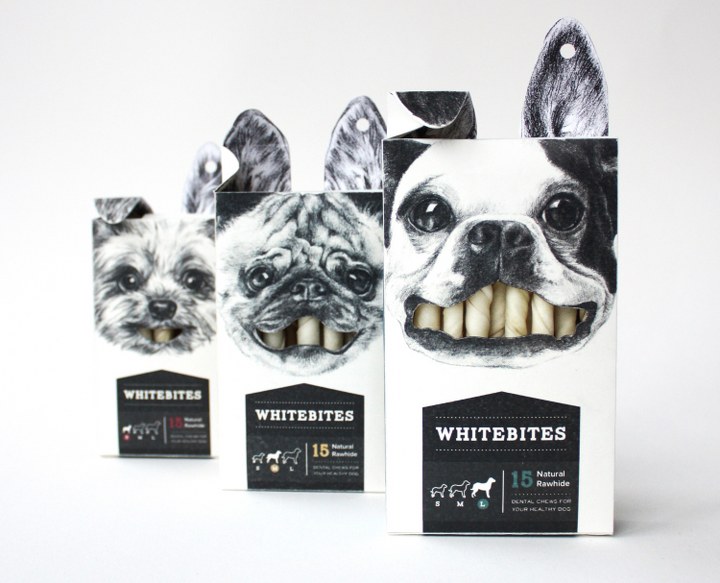
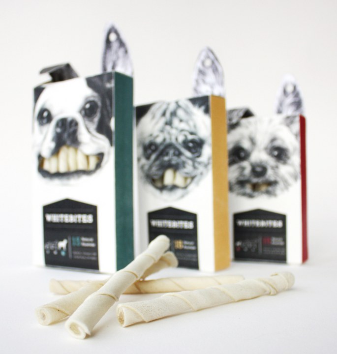
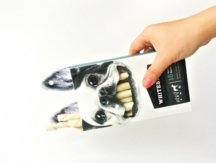
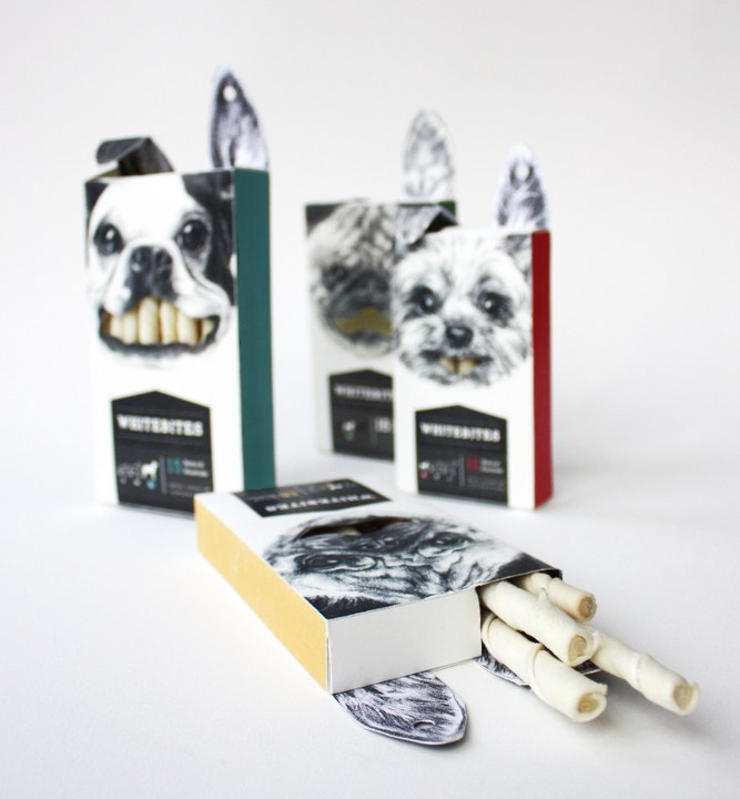
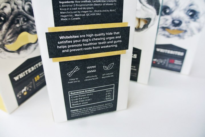
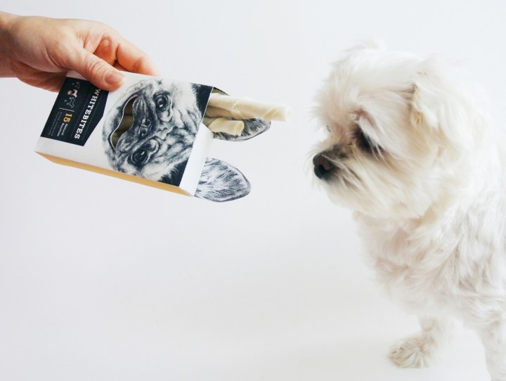
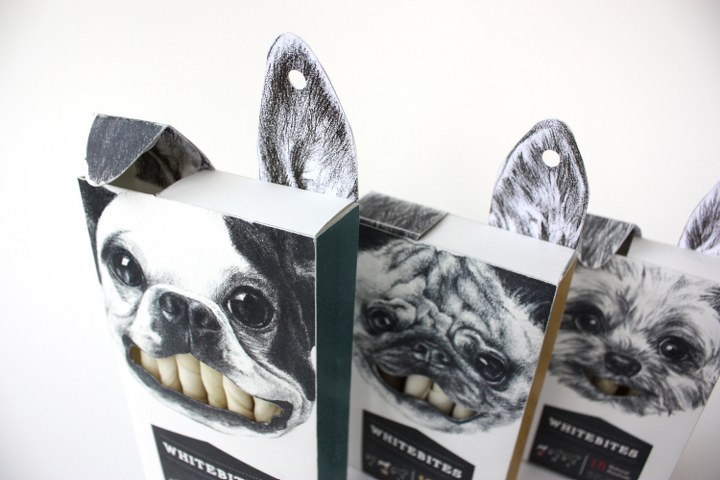
There are three different sizes available for the customers, and each size is differentiated by the type of dog illustrated and the diagram indicated on the bottom left. The mouth of each dog is cut out so that consumers can see the product inside, as well as view it as the white “teeth” of the dog. The left ear serves as a flap in which the user can open to slide out sticks one at a time instead of having to put their hands in the box. The other ear functions as a “hook” to put up on display racks. The package is meant to be a collectors’ item, and is also refillable with new rawhide sticks.
Designed by Cecilia Uhr


