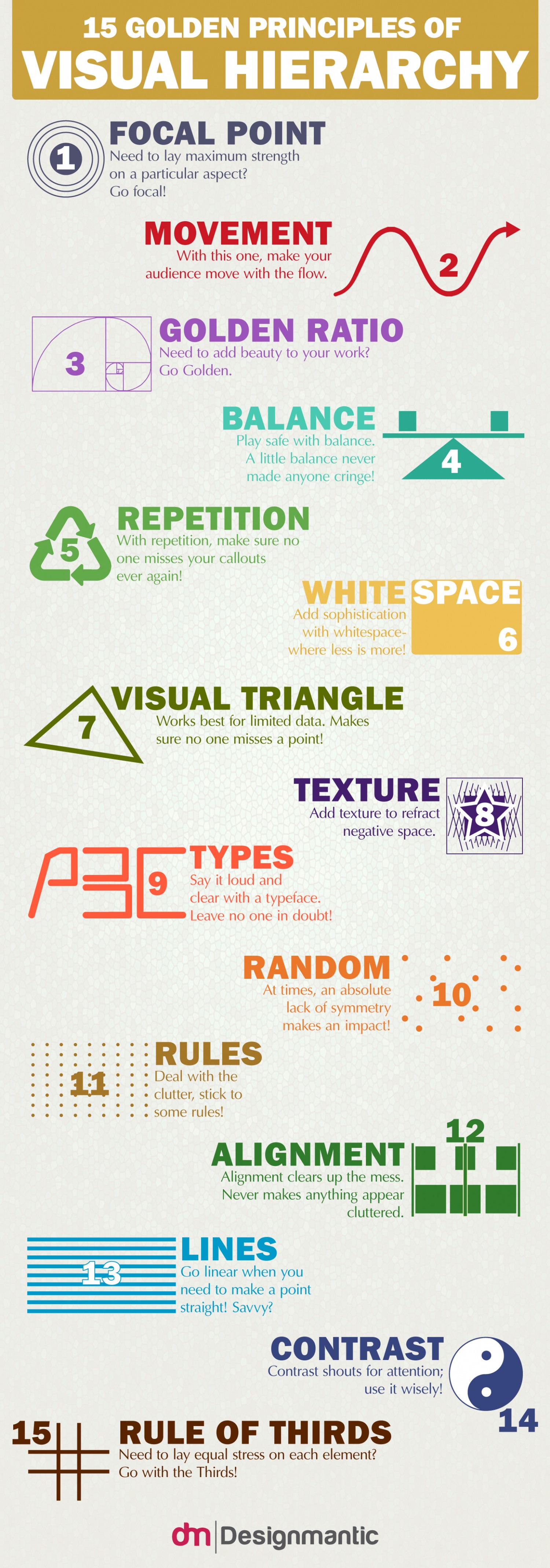
Visuals are everywhere and the commandments of visual communication serve as the complete guide to the art of designing. Visual hierarchy on the other hand, adds beauty and order to your design. It offers to your eyes visual assistance, suggesting to them, what information to linger on to, as your vision glides through it. It lays down a path for the data to flow in, to get absorbed into the brain smoothly. It guides the human eye from one element of the data to the next, like an invisible pointer moving through the data, to keep the reader free of any visual fatigue. Adding hierarchy to your design will not let your readers get intimidated by all the noise and clutter of the data.
Below, DesignMantic have outlined, the “15 Golden Principles of Visual Hierarchy” in order to dish out for you the various ways in which one can implement visual hierarchy in one’s data and reduce the noise. These are equally applicable to graphic as well as web design, while some principles like the Golden Ratio and Visual Triangle, offer immense help when learning to design memorable logos.

via DesignMantic


