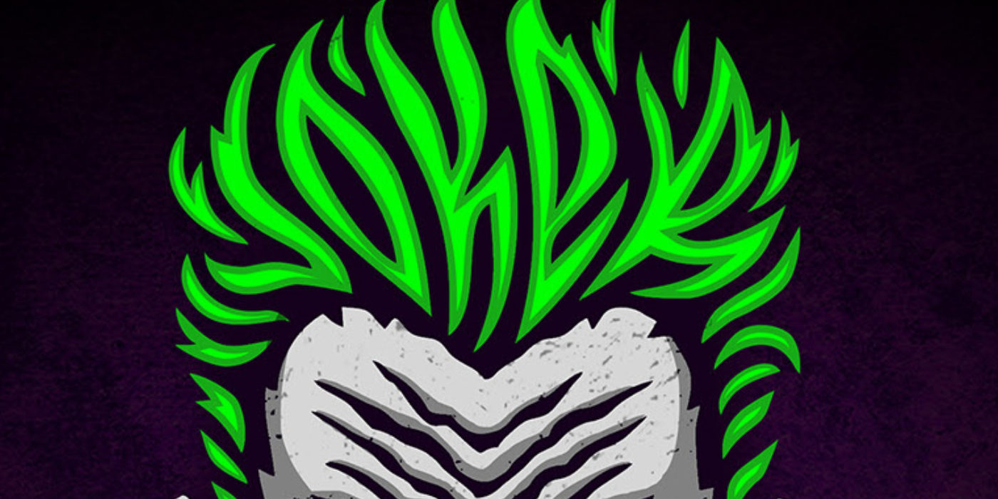
Sergey Kyrmanov has masterfully incorporated hidden typography into his captivating villain logos. With a keen eye for detail and a deep understanding of typography, Kyrmanov seamlessly integrates letters and words into the designs, adding an extra layer of intrigue and depth.

The hidden typography in Kyrmanov’s villain logos serves multiple purposes. Firstly, it adds a visual element that sparks curiosity and engages the viewer deeper. As one examines the designs more closely, they discover cleverly concealed letters and words intricately woven into the overall design.

Secondly, the hidden typography enhances the storytelling aspect of the logos. These hidden elements often convey messages or hints related to the villain’s character, story, or origins. It creates a sense of discovery, rewarding those who pay close attention with hidden insights and connections.

Kyrmanov’s expertise in typography is evident in how seamlessly he integrates the hidden text into the overall composition. The letters and words are skillfully manipulated to blend harmoniously with the rest of the design, ensuring a cohesive and visually pleasing result.

This incorporation of hidden typography also highlights the power of typography as a storytelling tool. It showcases how even small details can contribute to the overall narrative and enhance the viewer’s understanding and appreciation of the villain’s identity.

Sergey Kyrmanov‘s use of hidden typography in his villain logos is a testament to his creativity and attention to detail. By skillfully integrating letters and words into his designs, he adds an extra layer of intrigue and storytelling to these iconic characters. The hidden typography invites viewers to explore and uncover hidden messages, elevating the logos to a new level of artistic depth and complexity.


