


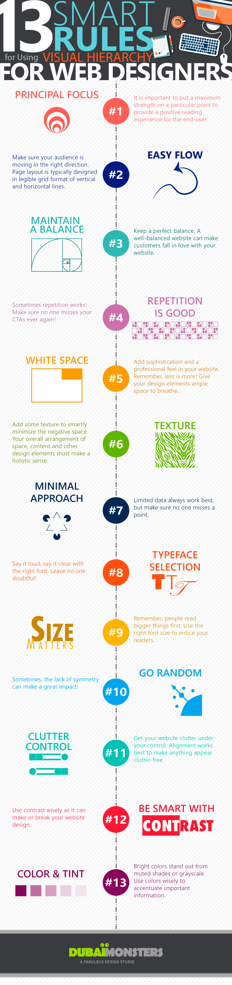
Being a web designer, you need to make sure your designs are communicating as efficiently as possible. Therefore, it is important to work with all the design elements, color, contrast, typefaces, spacing, texture, content, and other basic principles. Use everything wisely instead of just following a few trendy techniques. It is advised to arrange and prioritize design elements and text to help establish a focal point, providing readers an entry point, suggesting to and showing them where the most important information exists.
If truth be told, using a visual hierarchy can help you add an aesthetic sense and order to your design. It provides a path for the data to flow smoothly and to get easily grabbed by the viewers. It guides viewers from one element to the next, keeping them free of any visual fatigue. Adding visual hierarchy to your design will help your readers get rid of the cluttered information.
Here Dubai Monsters discussed 13 Smart Rules for Using Visual Hierarchy for Web designers in order to come up with a neat and clean design and reduce the clutter. These tricks will offer immense help when designing a business website, brochure design, flyer design, and logo design.
via Dubai Monsters
Comments
