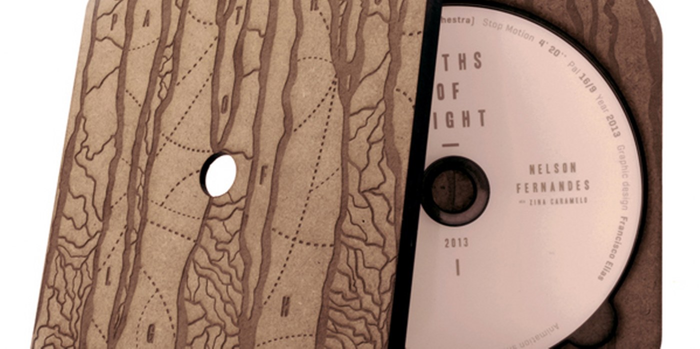
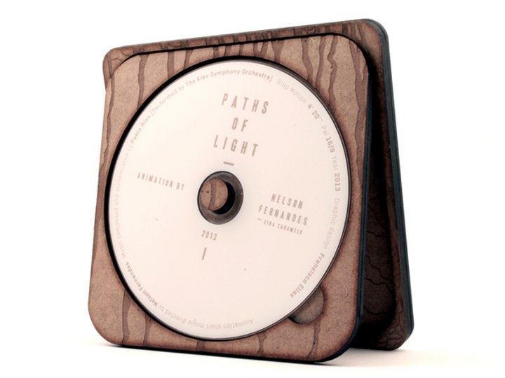
Packaging design by Francisco Elias for ” Paths of Light” short animation by Nelson Fernandes Aka Zina Caramelo
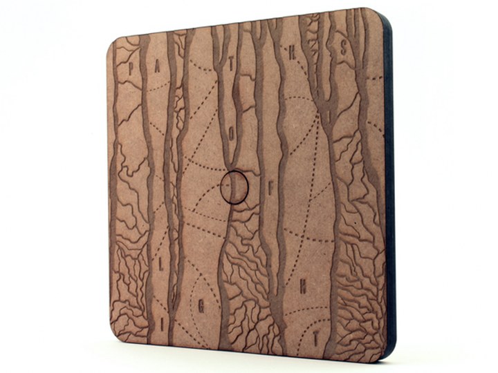
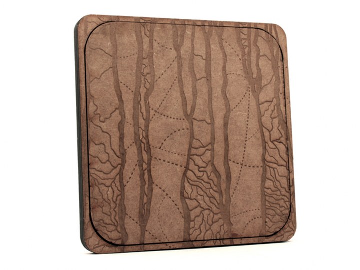
The best way to hold the short animation Paths of Light by Zina Caramelo was to ensure that the DVD had a beautiful case to match. The packaging actually looks like it was plucked from the woods and moulded to form a DVD. On the outside, various lines are visible, almost appearing as small trees growing up the side of the case. The wooden exterior also helps to give it an extremely naturalistic look. Paths of Light is an extreme update from the cases many saw for CDs in the 1990s, which usually consisted of basic plastic with a paper package to explain the contents inside.
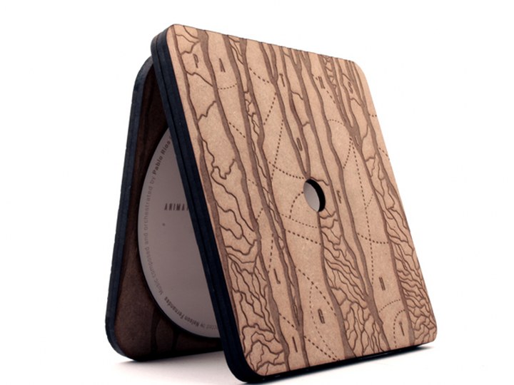
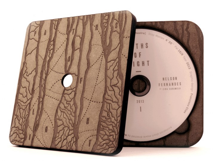
by Francisco Elias and Nelson Fernandes
via A’Design Award & Competition


