

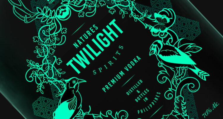
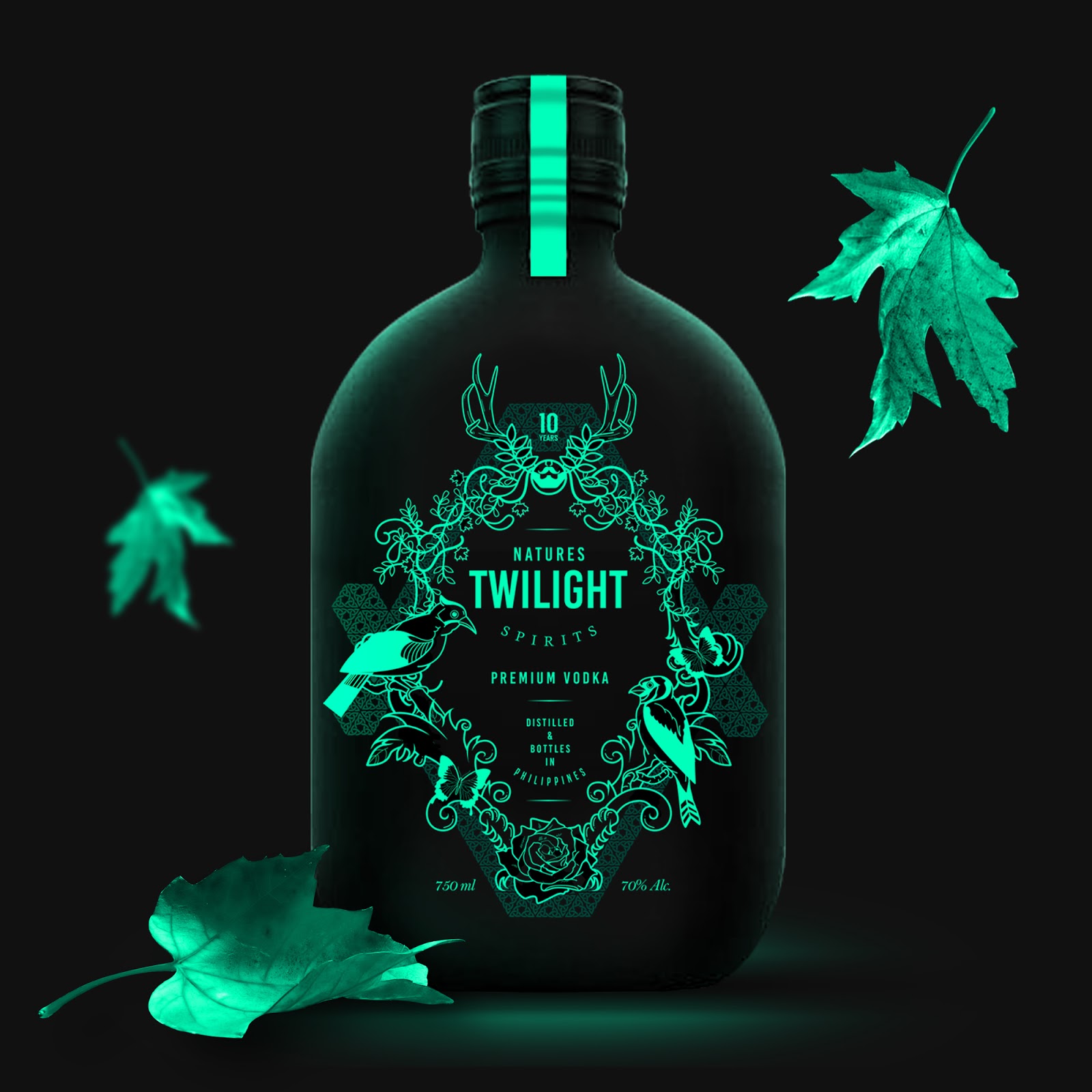
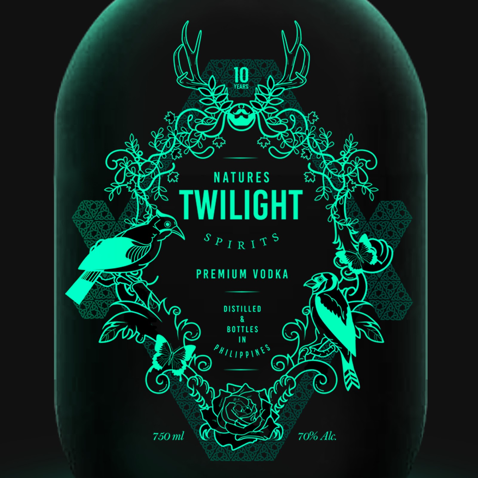
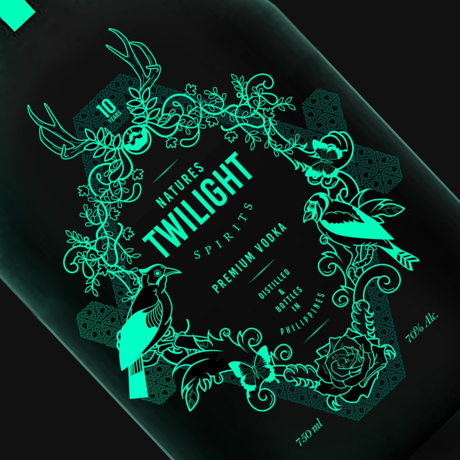
“The inspiration for Nature’s Twilight design came from the idea of forest and animals that lives within. What makes Nature’s Twilight different from the rest of the vodkas is the artwork speaks for itself and the content. The detailed work on the bottle gives that premium look. As you can see from the mock-up, there are birds, butterfly and vines giving the design a forest feel into it. Also added Antlers and Rose on the bottom part to give that one of kind style of vodka. Finally, the artwork is box in the a celtic style frame for the vintage feel. I picked the blue green color palette to give the artwork a cool and relaxing taste and compliment the actual product.” -Terence Lopez
Comments
