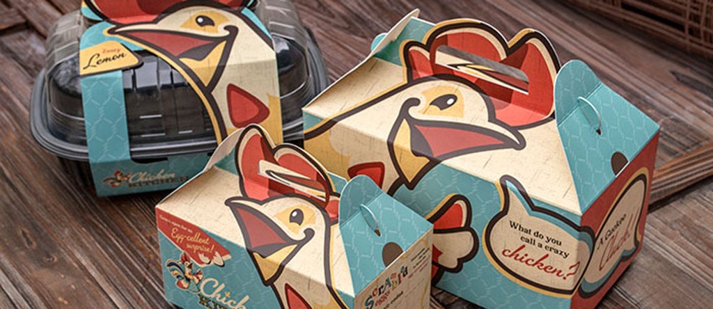
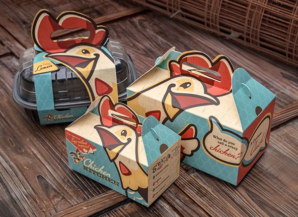
Lowes Foods grocery stores enlisted Wildfire to help brand their new “store-within-a-store” named the Chicken Kitchen in the deli section.
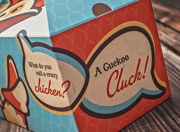
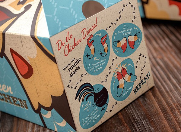
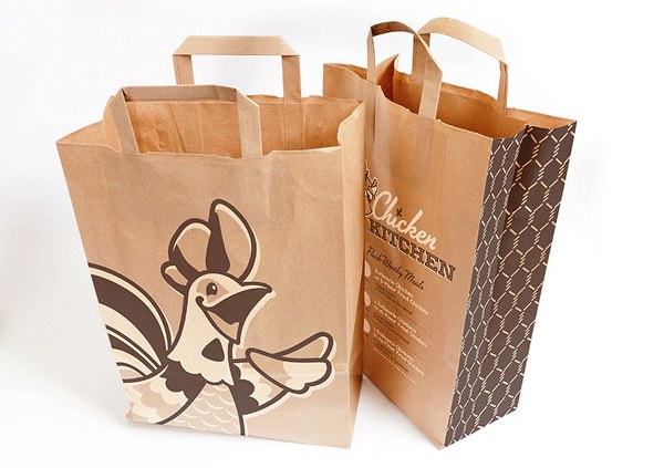
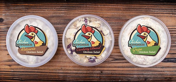
The branding is a unique, one-of-a-kind, fun and slightly folk art-inspired, meant to grab the attention of kids and parents alike. Custom die lines based upon the chicken character playfully distinguish the packaging, “breaking the frame” both physically and visually. Kids boxes were printed with several different variations of jokes and kids’ games on the side, as well as a surprise here or there if you were to take a peek under the box. Ultimately the packaging is one element supporting a unique store environment boasting ‘chicken you’d cross the road for.
Designed by Wildfire


