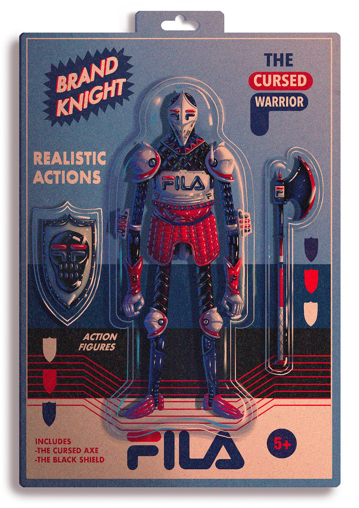
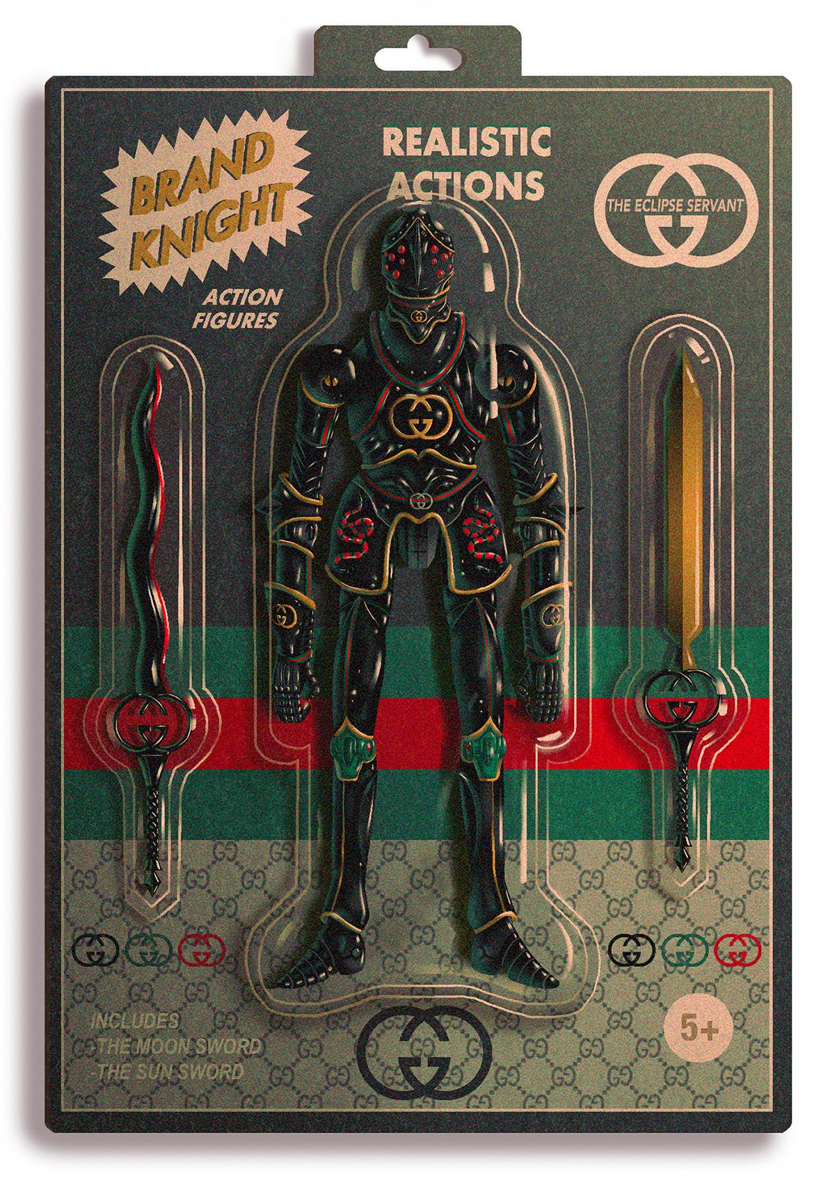
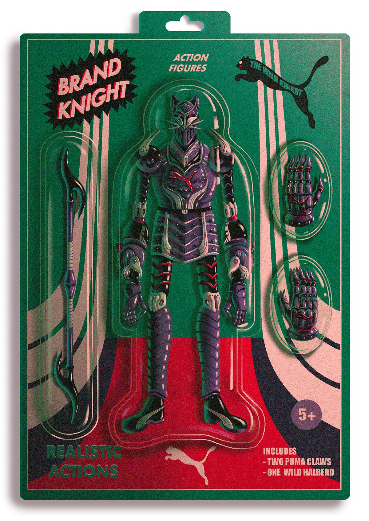
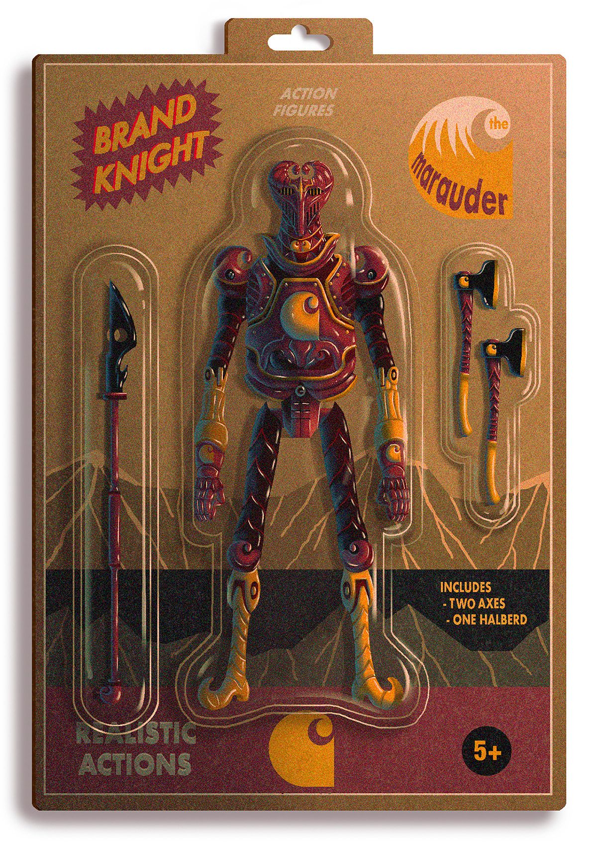
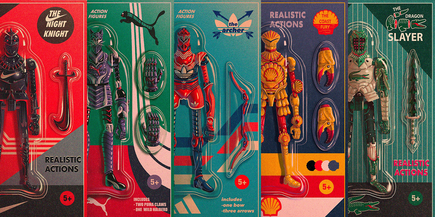
Switzerland-based artist Dexter Maurer has a very distinct style. These “Brand Knight” action figure illustrations are a perfect example of Maurer’s signature surrealist look. Unlike other illustrators, Dexter Maurer creates works of art that almost feel timeless.
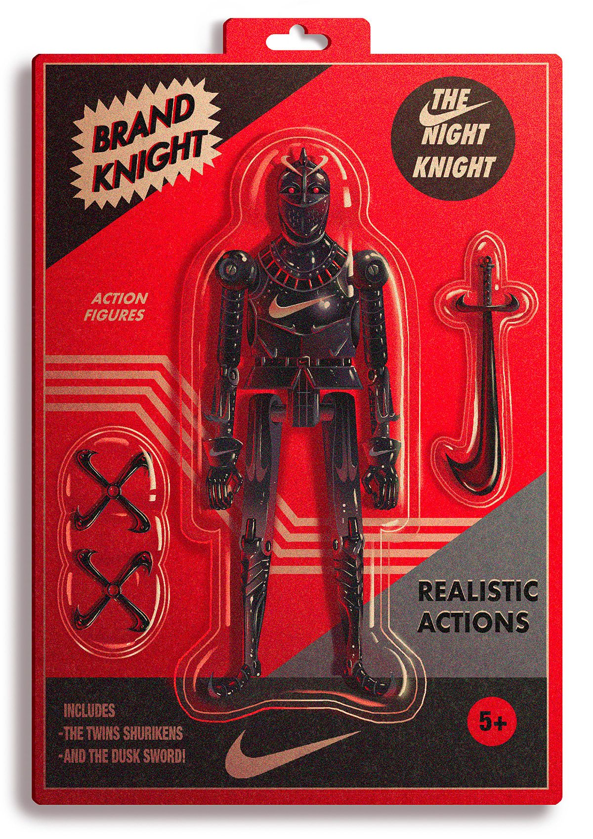
A warm and fuzzy aesthetic beautifully complements the vintage package designs on these action figure illustrations. The action figures themselves, however, are the most cleverly-designed aspect of the entire project.
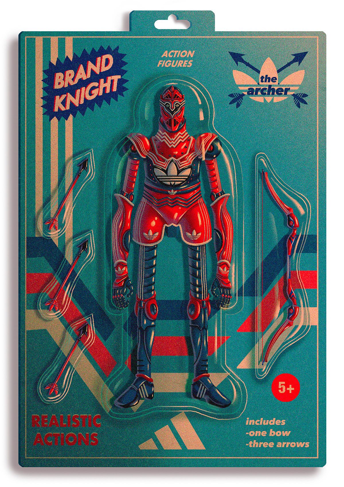
Using brand identities from various famous companies, Maurer created unique warrior-knight action figure concept art. Dexter integrated each brand’s color scheme into the packaging palettes, but he maintained a “retro” feel by tweaking specific color temperatures and color combinations.
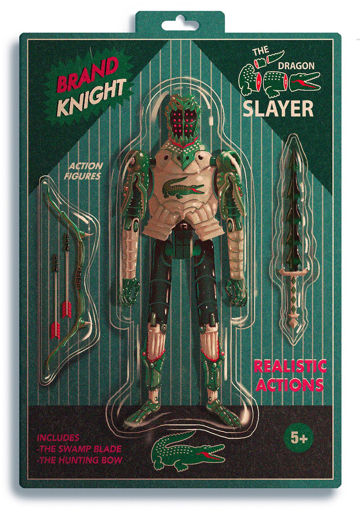
These action figure illustrations are absolutely stunning. Each package design has its own unique retro-minimalist pattern, yet the overall style remains consistent throughout. The use of color is bold and eye-catching. However, the attention to detail sets these illustrations apart from other projects.
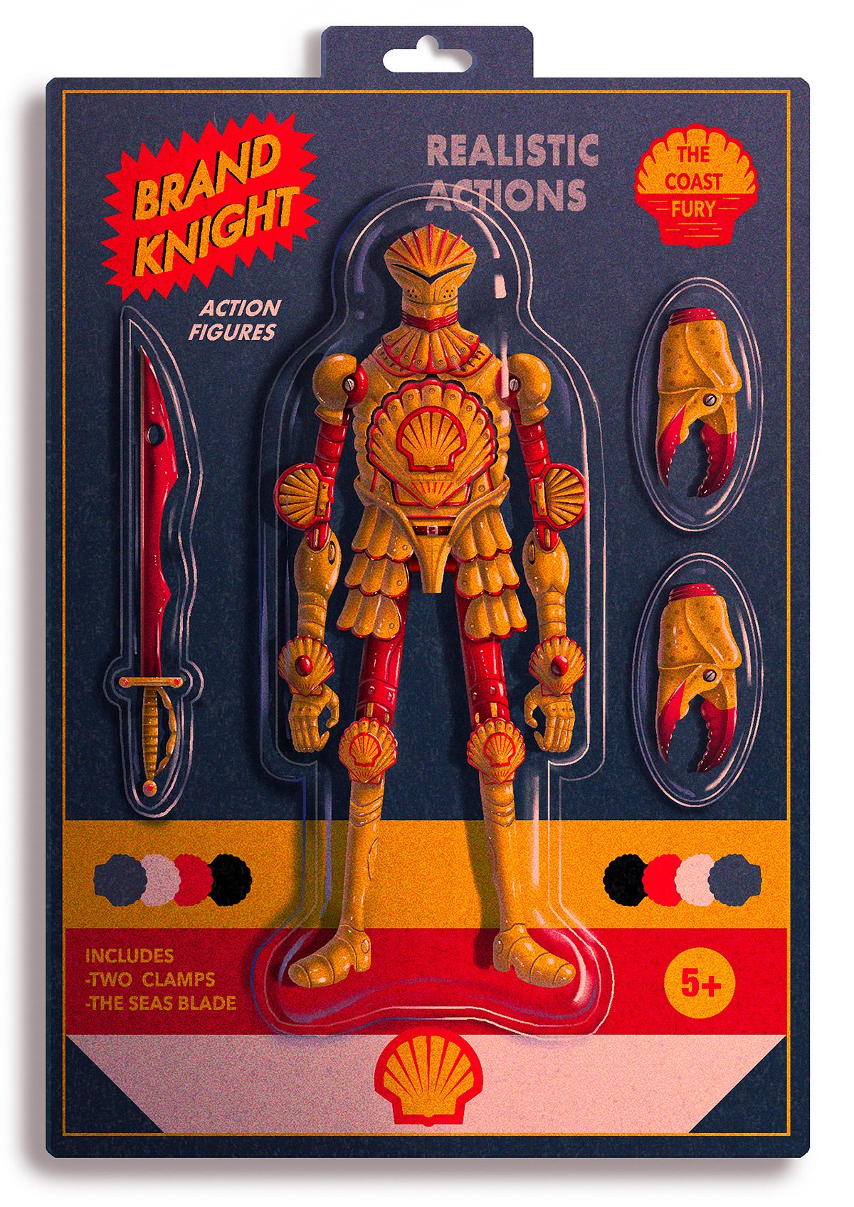
The reflections on the figures and plastic bubble packaging are beautifully-done. Even the subtle shading on the packaging backing cards help set the tone. Dexter cleverly integrated the brand’s logo into each uniquely-designed set of armor. And finally, the addition of character and weapon names on the packaging is a nice touch.
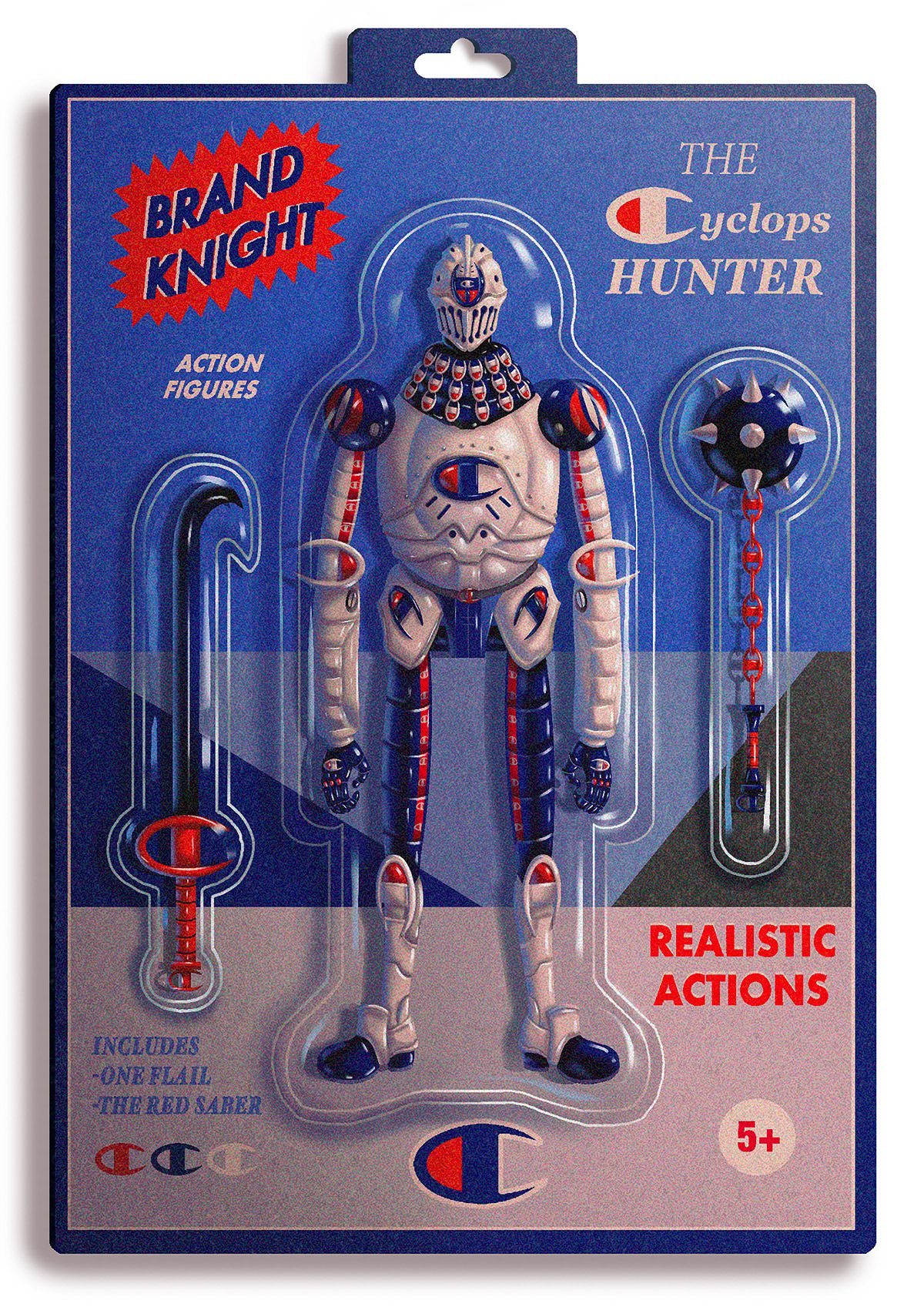
Overall, these action figure illustrations by Dexter Maurer are quite impressive. One could get lost looking over all the details in the design. In fact, why don’t we do that right now by taking a closer look!
